Primary
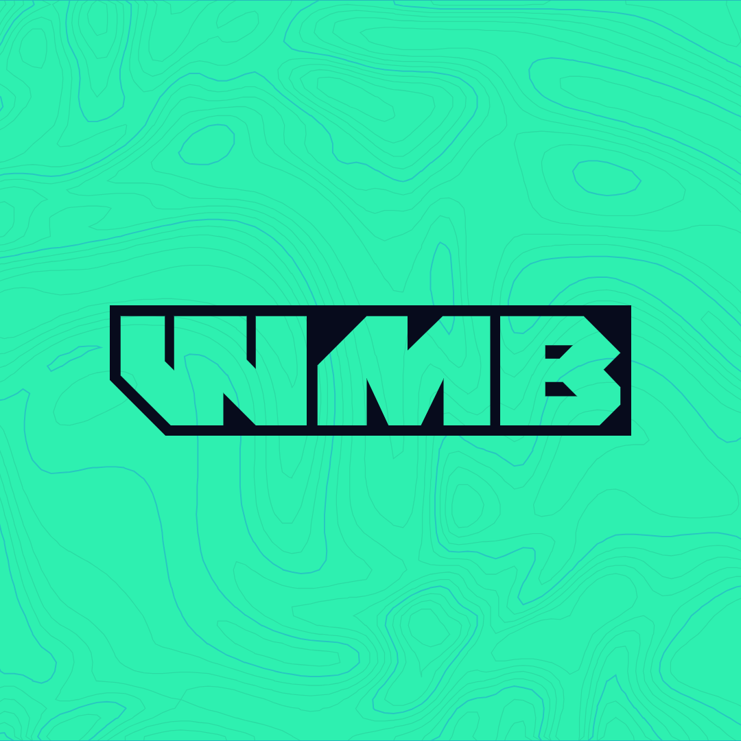
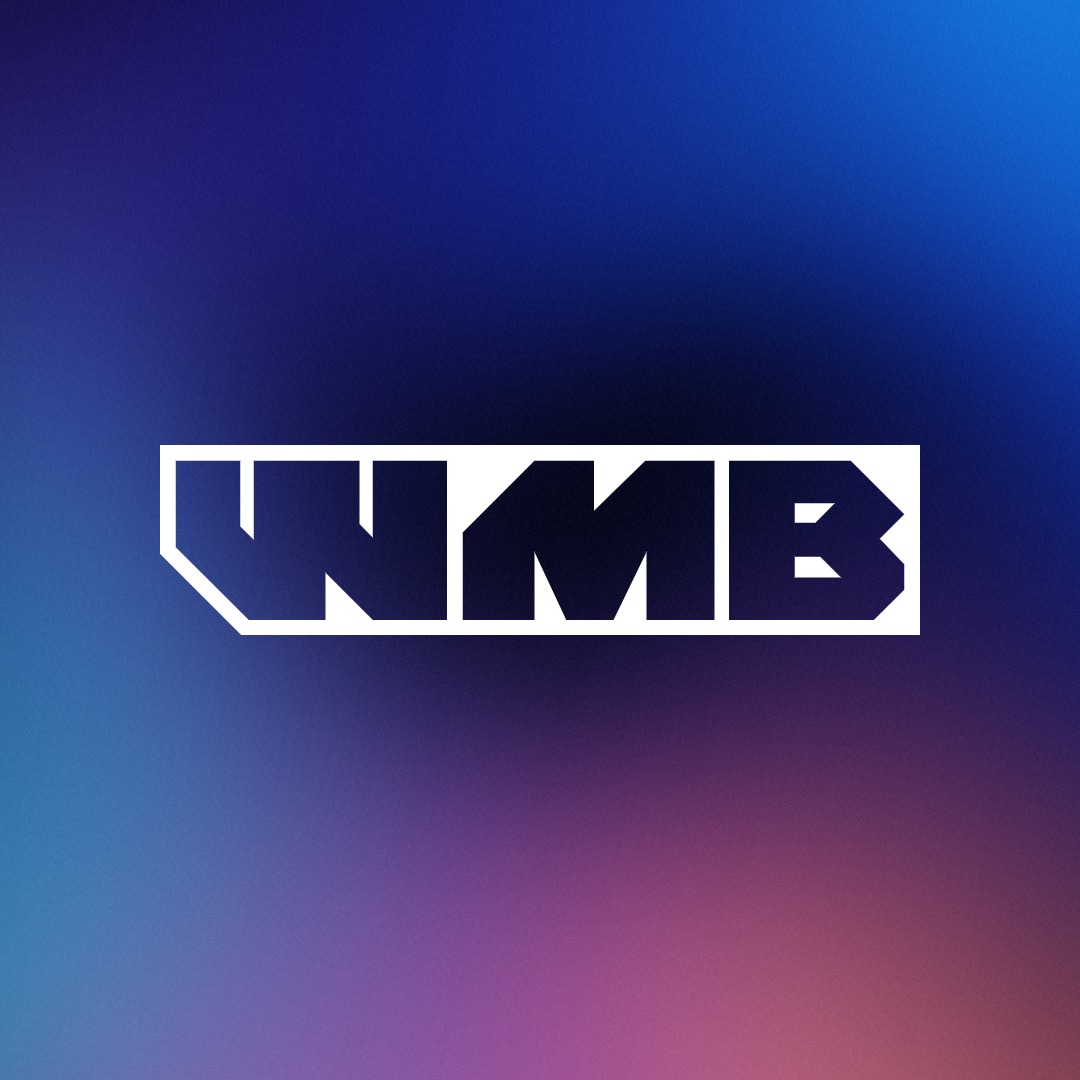
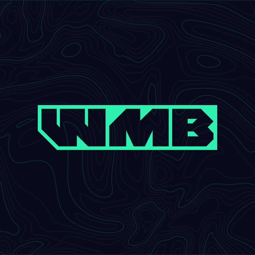
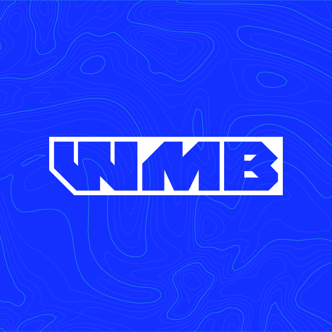
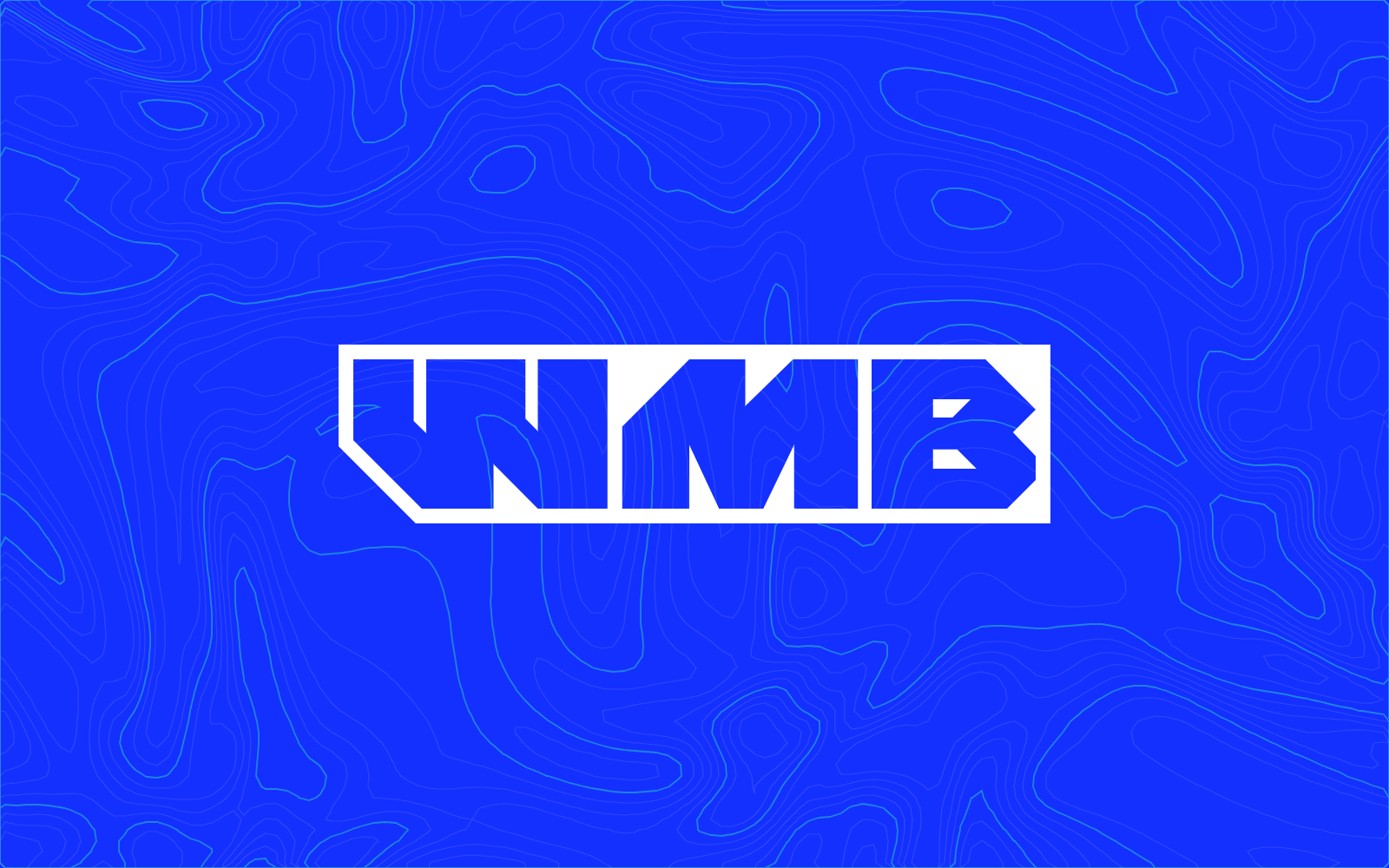
The bar with the letters cut out. Use it almost everywhere. Whatever sits behind it shows through the letters, so it works on colour, gradient and photo.
A mark cut from one block, a gradient taken from a Darwin sunset, and type built to read in full sun. This page shows how it fits together and has every file you need.
The letters are knocked out of a solid bar, like a part cut from plate on the bench. The W turns to face the M, and the bar takes the same 45 degree cut on its front corner.
Read it left to right and it's a hull. A raked bow at the front and a square transom at the back.
Everything else follows from that one cut. Corners are square. The bow turns up on buttons, labels, cards and the menu. Round shapes are kept for one meaning, a sonar ping. The result reads as mechanical and confident.
If you grew up on wake, moto and skate, you know this look. The brands of that era wore thick, angular marks that read on a jersey at full speed and still looked good peeling off a ute window.
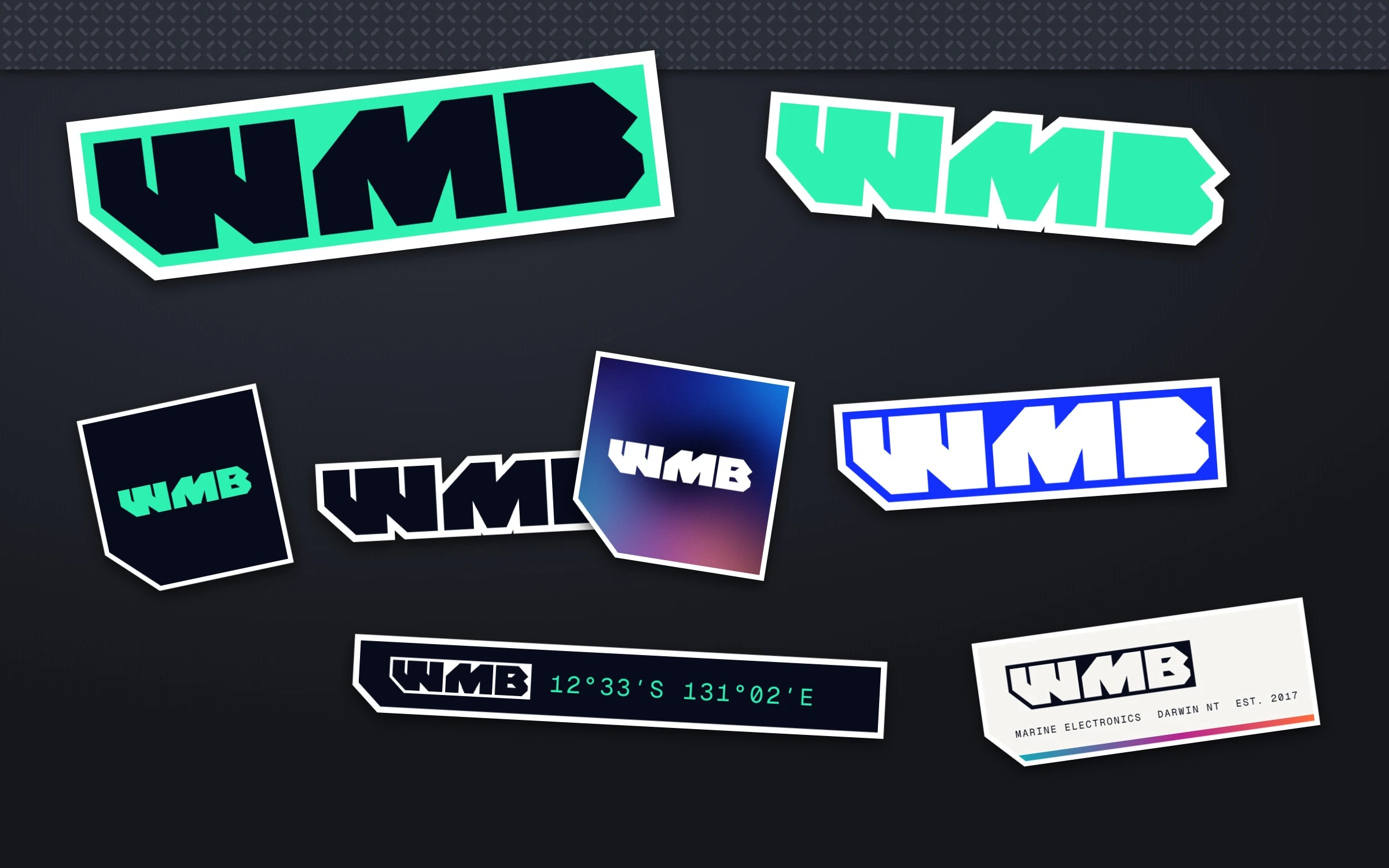
Sponsor stickers down a helmet. A logo across the back of a wake vest. A decal along the side of the tow vehicle. The marks that stuck were heavy, simple and sharp, and they looked fast standing still.
WMB takes that attitude and keeps it tidy. It's one solid shape, so it cuts cleanly as a die-cut sticker, prints in a single colour on a shirt and still reads at the size of a stamp. Stick it on toolboxes, eskies, rod tubes and the back window of the ute.
The bar with the letters cut out. Use it almost everywhere. Whatever sits behind it shows through the letters, so it works on colour, gradient and photo.
The letters without the bar. Use it big, where the bar would feel heavy. Signage, the back of a shirt, the site footer.
The bar with Wire My Boat beside it in WMB Block. People know the name before the monogram, so the two travel together wherever the business introduces itself. The site header, signage, the first posts after launch, quotes and invoices. Stack the name on two lines where space is tight.
The letters on a square tile with the bow. For profile pictures, app icons and anywhere small and square.
The logo takes one colour and lets the background do the talking. Volt and Harbour dusk are the signatures. Pick whichever suits the place.
Seven colours. Night water and paper carry the reading. Volt is the one thing on screen that asks to be pressed.
Signal blue sky, teal water, a band of neon magenta and the Top End sunset, around a pool of night water. On the home page it drifts slowly behind the headline. Everywhere else it's a still from the same source.
Where the full gradient won't fit, the stripe stands in for it. Water on the left, sunset on the right.
WMB Block is the brand's own face for the big moments, drawn from the logo by Skella & Co. Archivo carries the words and Geist Mono the labels. Both are free from Google Fonts, so any printer or sign writer can match them.
The hero and the biggest lines only. Capitals, figures and headline punctuation on the logo's grid, with the logo's own W, M and B. Short lines, never body copy.
Wire My Boat holds a licence for its own brand. A printer, sign writer or agency working on Wire My Boat jobs gets the files through the Skella & Co foundry (opens in a new tab).
Marine electronics
for the Top End
ABCDEFGHIJKLMNOPQRSTUVWXYZ
0123456789 & .,:;!?’“”-/+()°′
Every other headline. Weight 800, width 118 percent, tracking slightly tight.
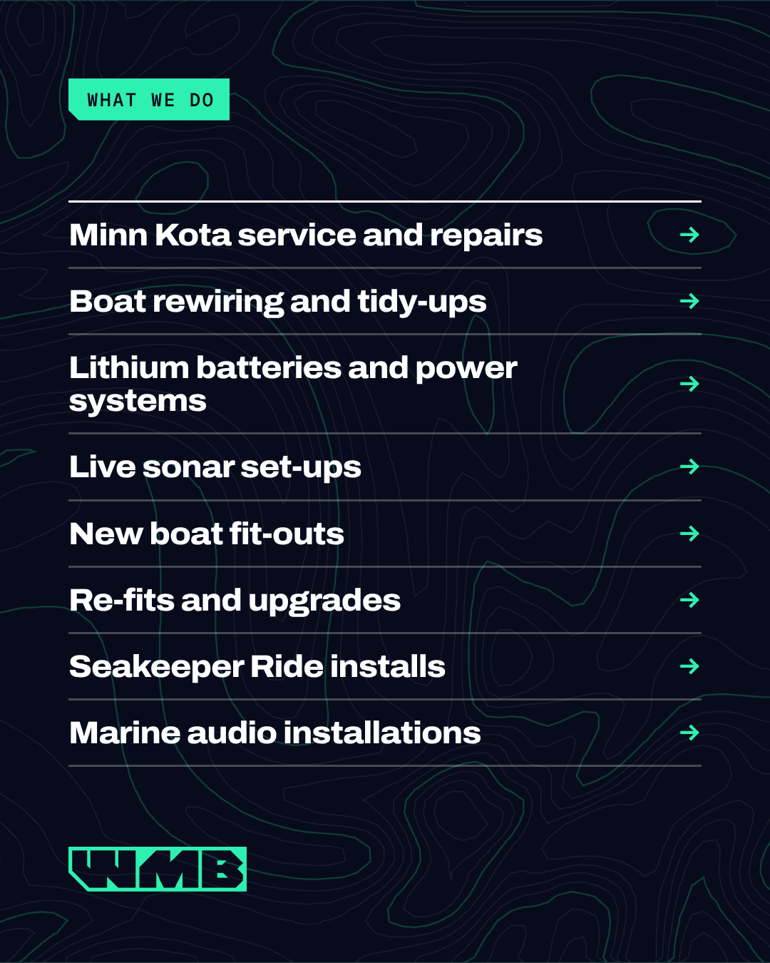
Seven jobs we do every week
Everything you read. Normal width, regular and semibold.
Old boats collect wiring. We strip it back and rebuild it properly, with every circuit labelled, and hand over a diagram with the boat.
Labels, data and small print. Upper case with open tracking.
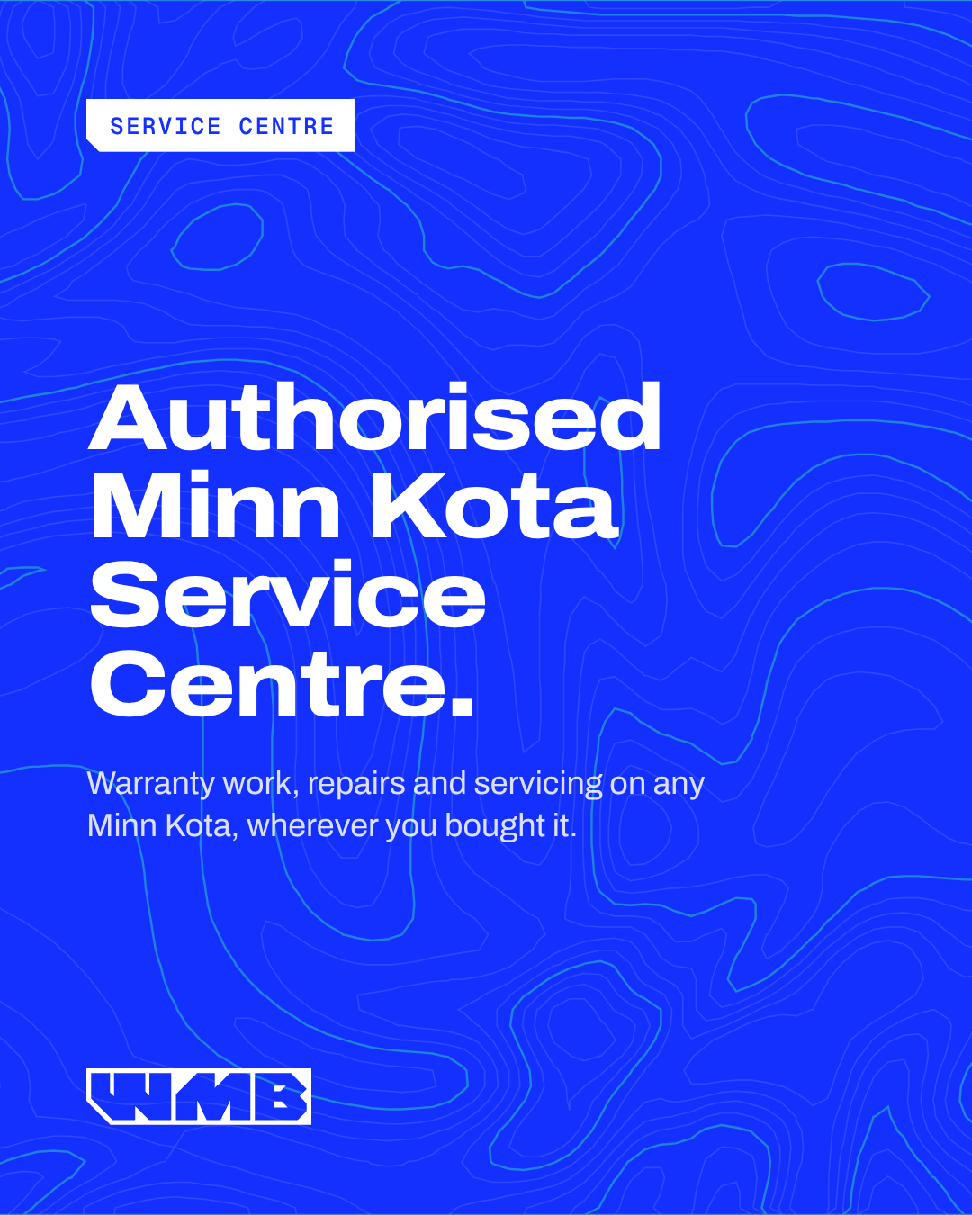
Authorised Service Centre 12°32′S 131°02′E Est. 2017
Nothing drifts or fades up. Things arrive fast and stop on the mark, like a part dropping into a jig. Four moves cover the whole site. Tap one to run it again.
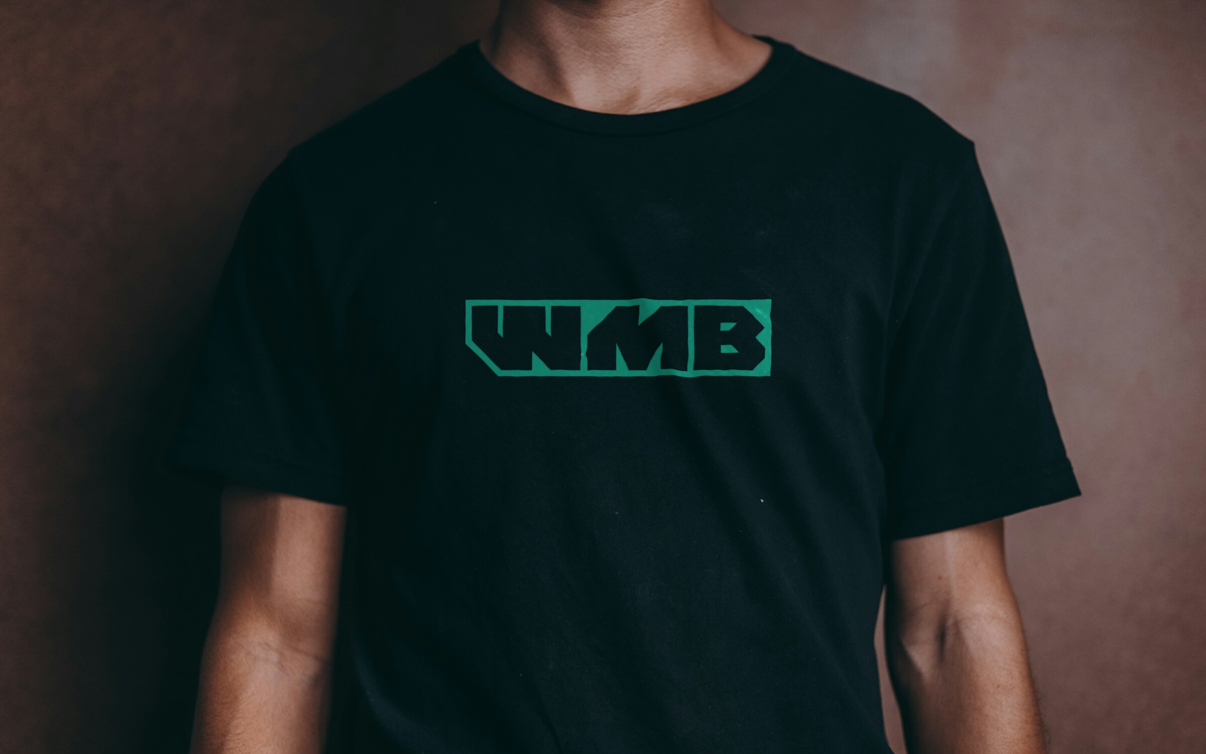
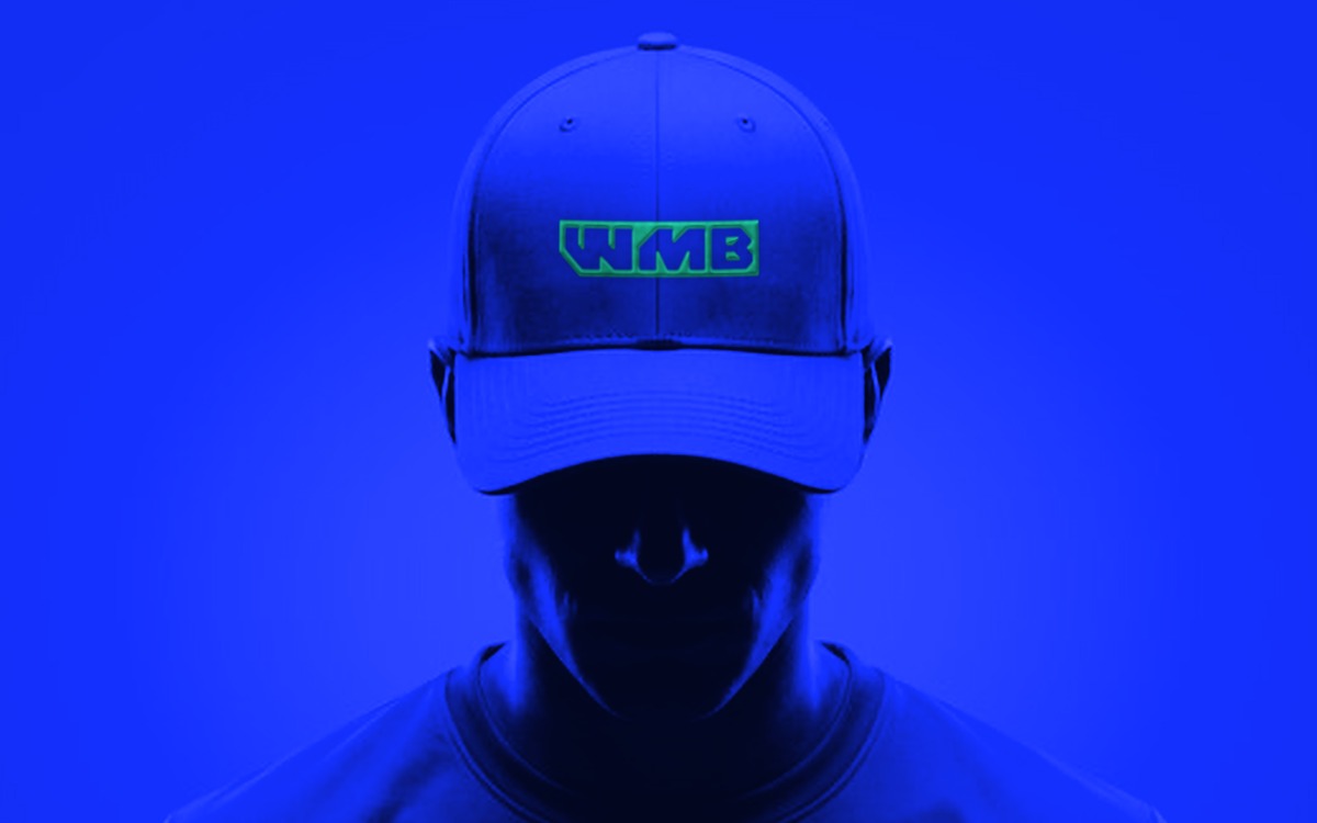
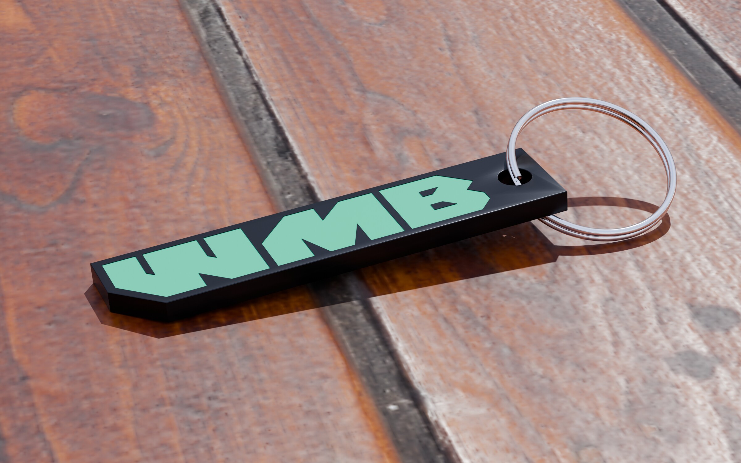
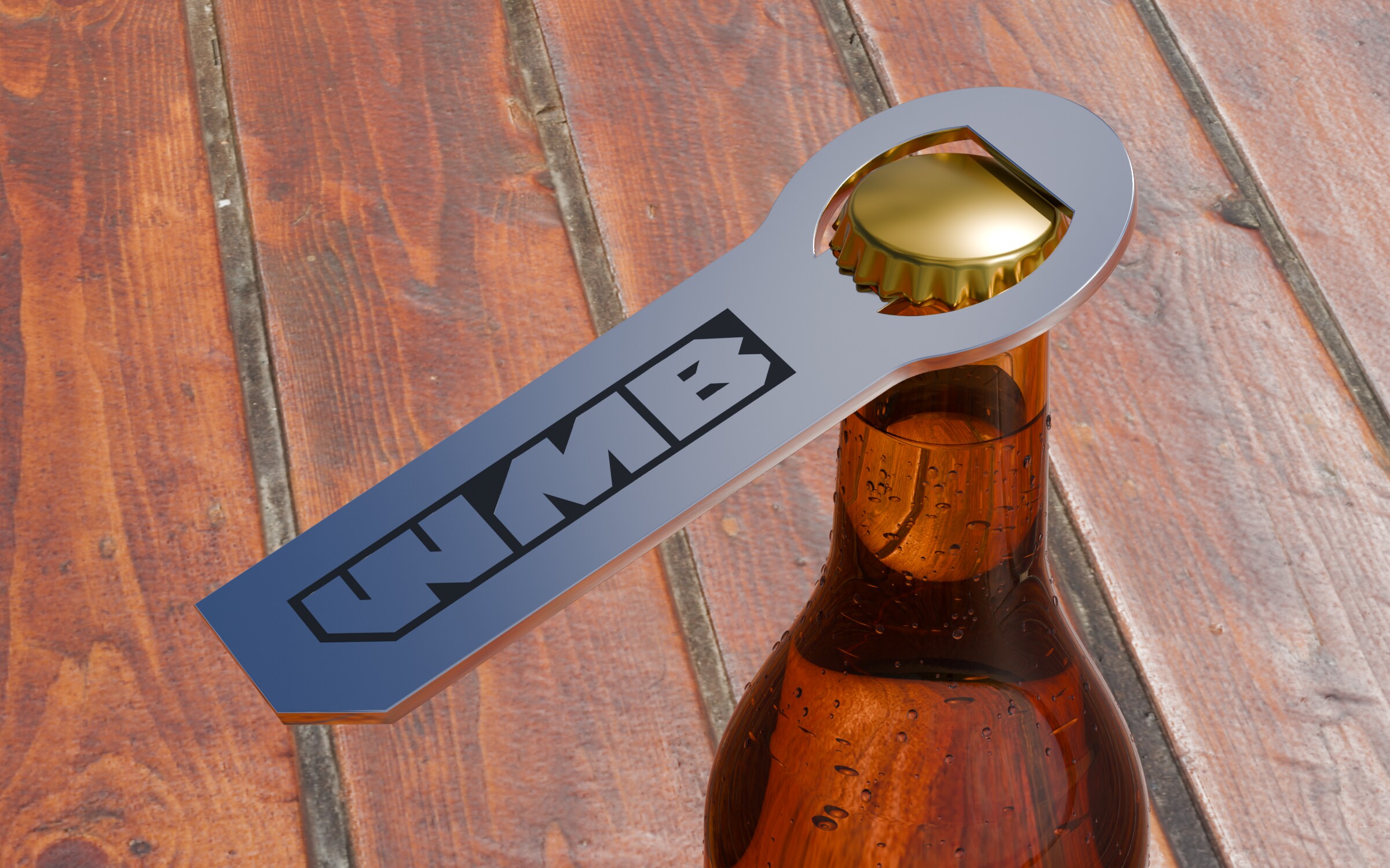
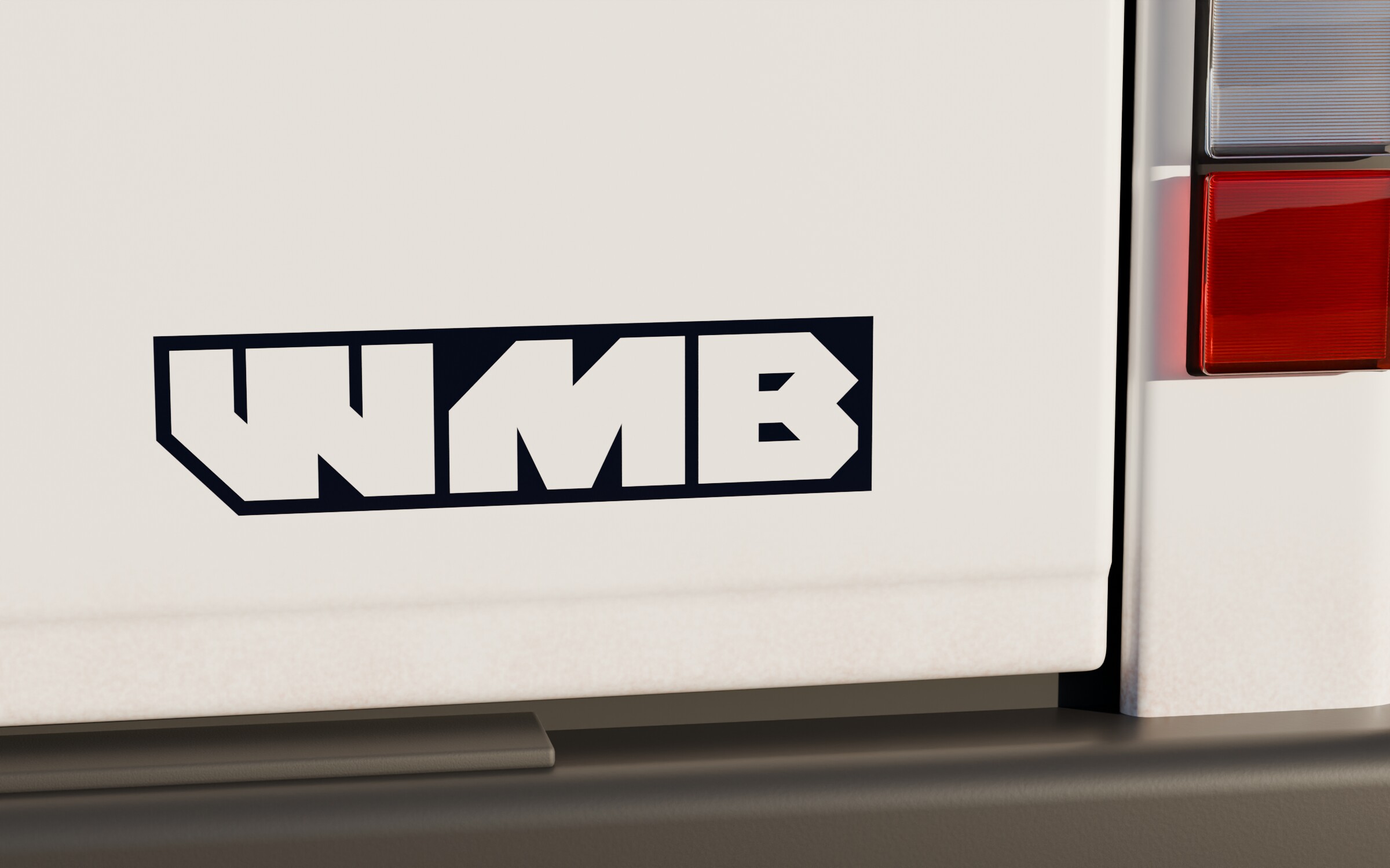
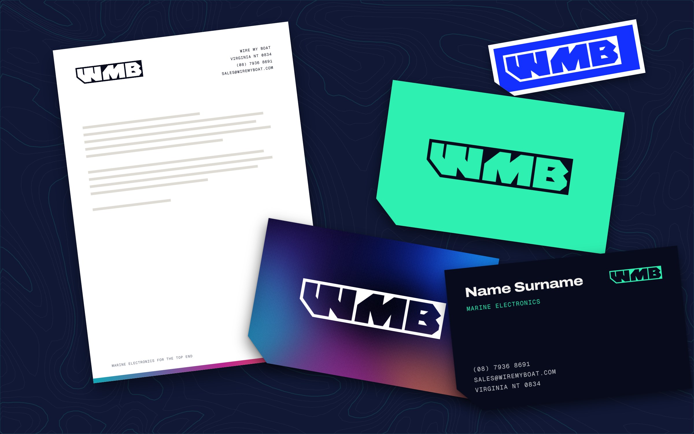
A mark this simple holds up on a tee, a cap, a tailgate and a stubby opener. Every one is made from the real logo, embroidered, printed, engraved or cut from vinyl.
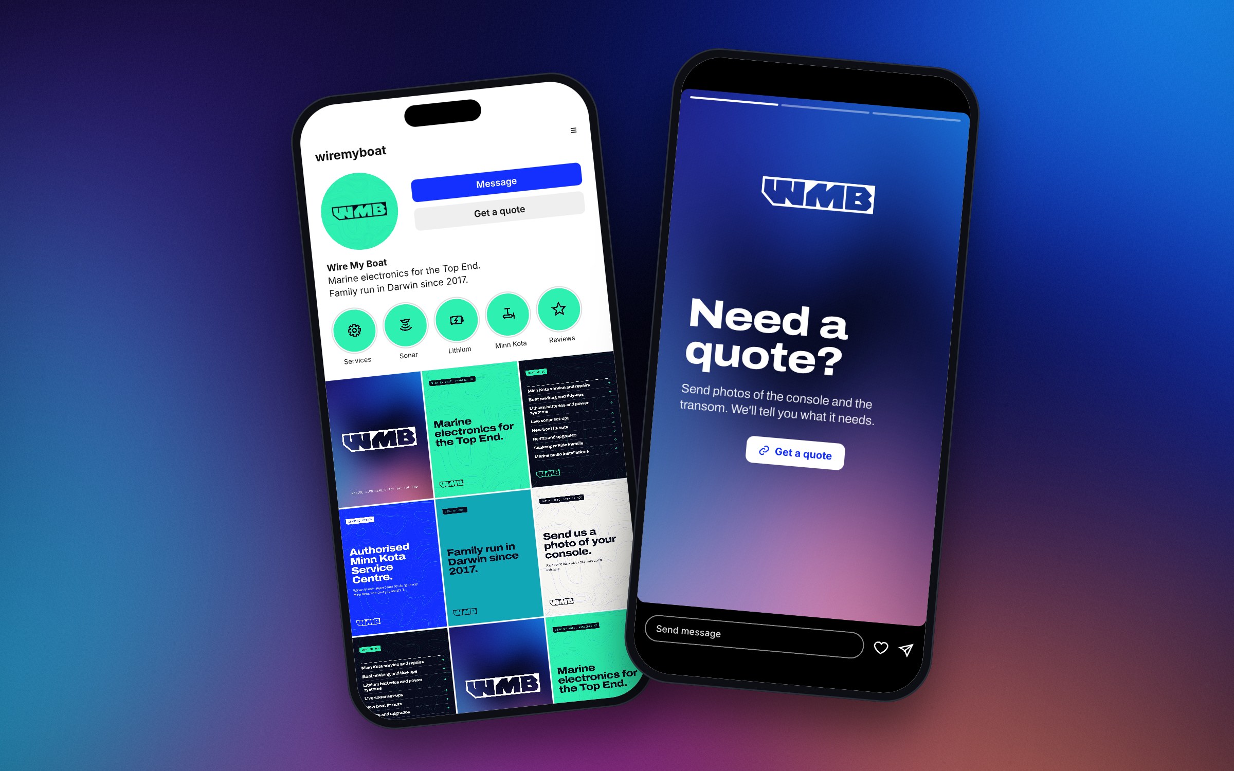
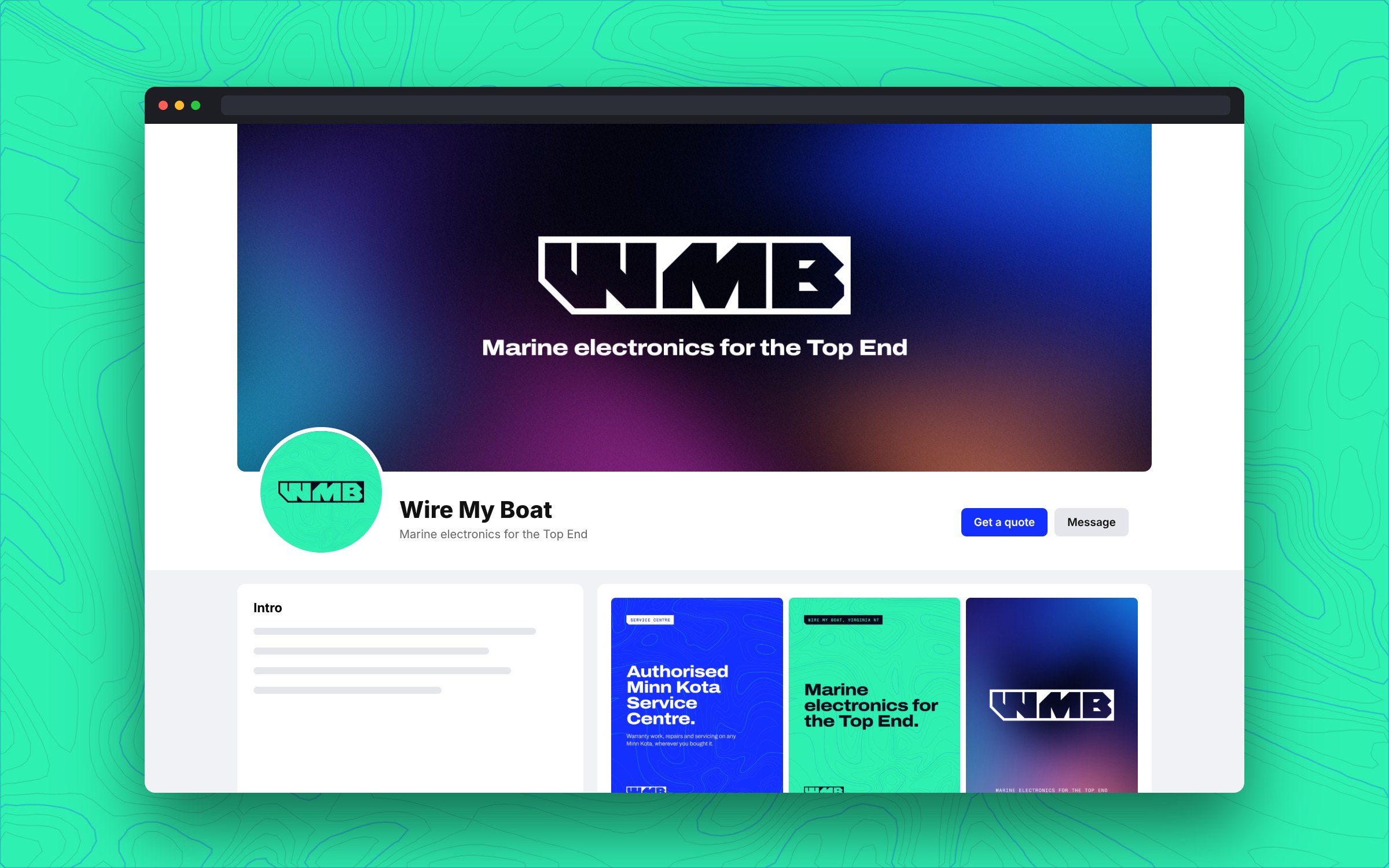
Every file is sized for where it goes, with nothing important near the edges. Swap them around whenever the feed needs a refresh.
1080 square. Shown here in the circle Facebook, Instagram, WhatsApp and Google crop them to.
1640 x 624, twice the size Facebook shows on a desktop. The middle stays clear of the crop on phones.
1920 x 1080.
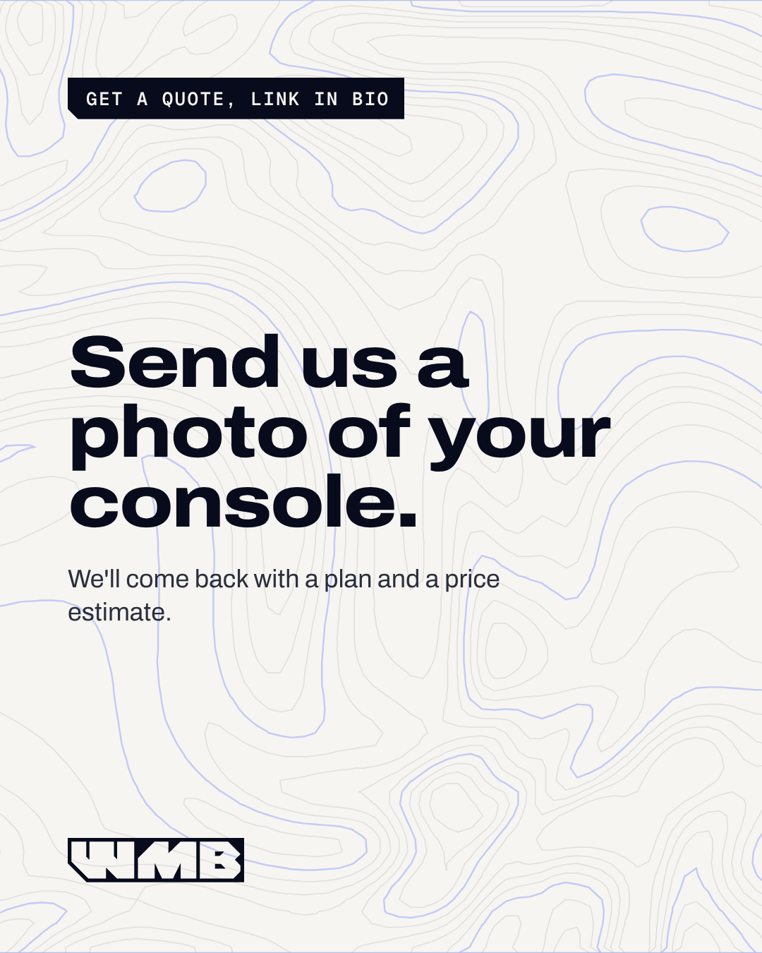
1080 x 1350. A launch set to post over the first few weeks.
1080 x 1920. Three backgrounds to put your own photos and text on, and one ready to post.
One for each highlight. Instagram crops the middle to a circle.
Transparent PNGs at 2400 pixels wide, each with an SVG that scales to any size.
The logo on each brand colour, 1600 x 1000, for decks and documents.
Fill in your details, copy, then paste into your email settings.
Hi Sam,
Your boat's ready to pick up from Friday. Call if anything comes up before then.
Cheers,
How it looks in most inboxes.
Opens your signature settings in a new tab. Keep this page open. If no tab opens, open Outlook settings.
Outlook on the web and the new Outlook on Windows share this signature. In classic Outlook, open a new email, choose Signature, then Signatures, and paste it there. If the layout changes, choose Keep Source Formatting from the paste options. In the new Outlook, undo and drag the signature from the preview into the box.
Copying from Chrome or Firefox gives the cleanest paste. If the logo turns up as an attachment on sent emails, copy again from one of those.
Scan this with your iPhone camera. This page opens with your details filled in.
Email me this linkNo shake to undo? Turn it on in Settings, Accessibility, Touch, or swipe left with three fingers. Still plain? Once the signature works on your computer, send yourself an email, open it on your phone, and copy the signature from there.
Opens your settings in a new tab. Keep this page open. If no tab opens, open Gmail settings.
The Gmail app on your phone uses this signature too. If the app has its own signature, delete it.
Thunderbird takes code, not a paste. Tick Use HTML in its signature settings, then paste what Copy HTML gives you, under Other ways to copy.
Your signature should drop into the new draft.
HTML is for email tools that ask for code, like Thunderbird. Plain text suits the signature box on some phones. The download is a signature file for classic Outlook on Windows, for when pasting goes wrong. It goes in the Signatures folder, in place of one with the same name.
Fill in their details above, then send them this link. It opens with everything filled in. The details travel in the link, and we keep no copy.